INFO
Challenge & Solution
Services
- // Branding
- // User Experience
- // Art Direction
- // User Interface
Role
- // Creative Lead
- // UX Designer
Research & Strategy
After some meetings with NYCC and having them share key information and insights with us, we know that they wanted to retain their current market and acquire new target audiences. We created three basic and generalized personas to help represent the users that we would be targeting. The first catering to their original users, and the second and third catering to their potentially new target audiences.
Persona 1: 32-68yrs
This user might be older in the spectrum of life. He or she goes on to the NYCC website and knows exactly what kind of entertainment they want to buy tickets for. They are a regular user of the website, although they have been getting used to using mobile solutions to buy things that they want.
Persona 2: 18-38yrs
This user is Savvy with technology and is accustom to buying things through mobile mediums. They are interested in the arts and would love to see what kinds of shows and events NYCC has to offer as opposed to other potential outlets.
Persona 3: 18-60yrs
These users are either students or know of someone that might be interested in learning or participating in potential shows and events. They would like to know what the NYCC heritage is and what types of classes, workshops and events NYCC has to offer.
Analysis & Prioritization
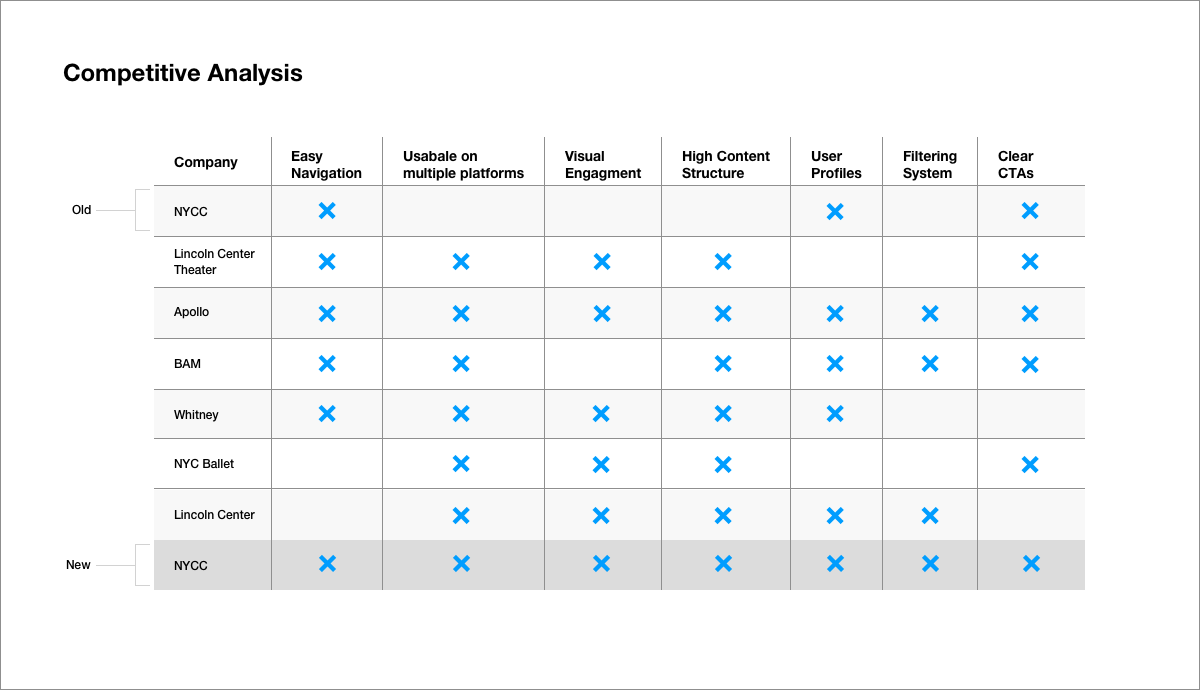
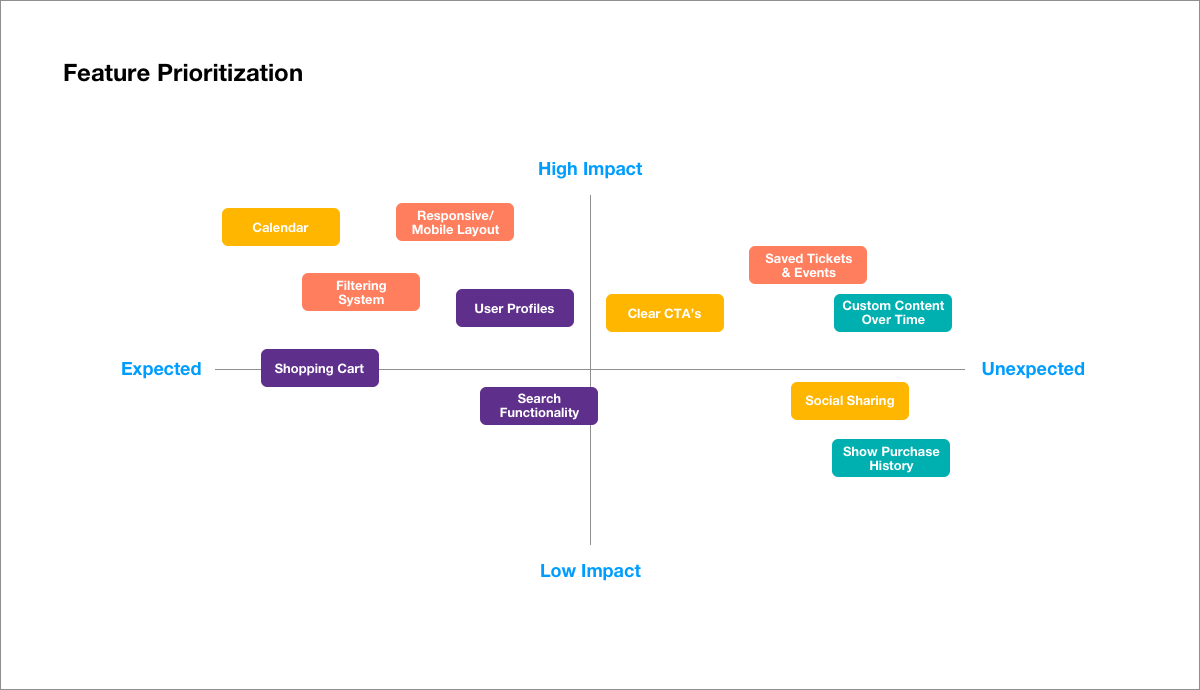
It was revealed early on that NYCC didn’t really have analytics being tracked on their website in order to gain plentiful information on what works on their website, where do people come from, and so on. So we did the next best thing, we studied their competitors and other organizations that similar goals in mind. We went through these different websites and looked for specific trends and tools that they had in common. We then went further and started studying what functionality and tools worked best for users and chose what to incorporate into the new NYCC website.
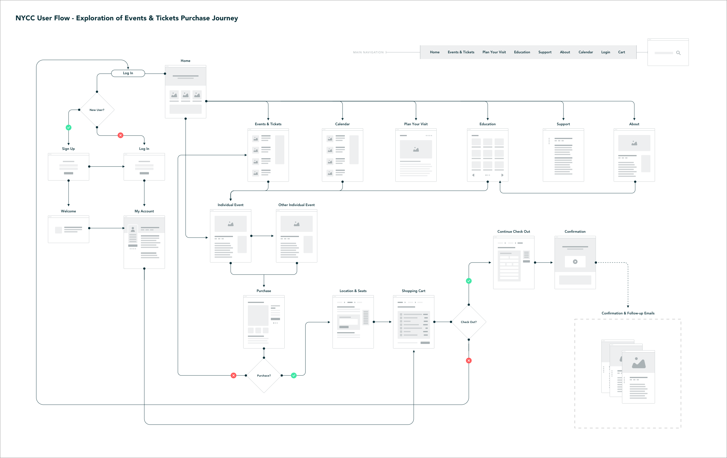
The User Flow
The main purpose was to plan a journey for all three personas that could potentially get them to learn and buy tickets to the events and shows they were ultimately invested in.
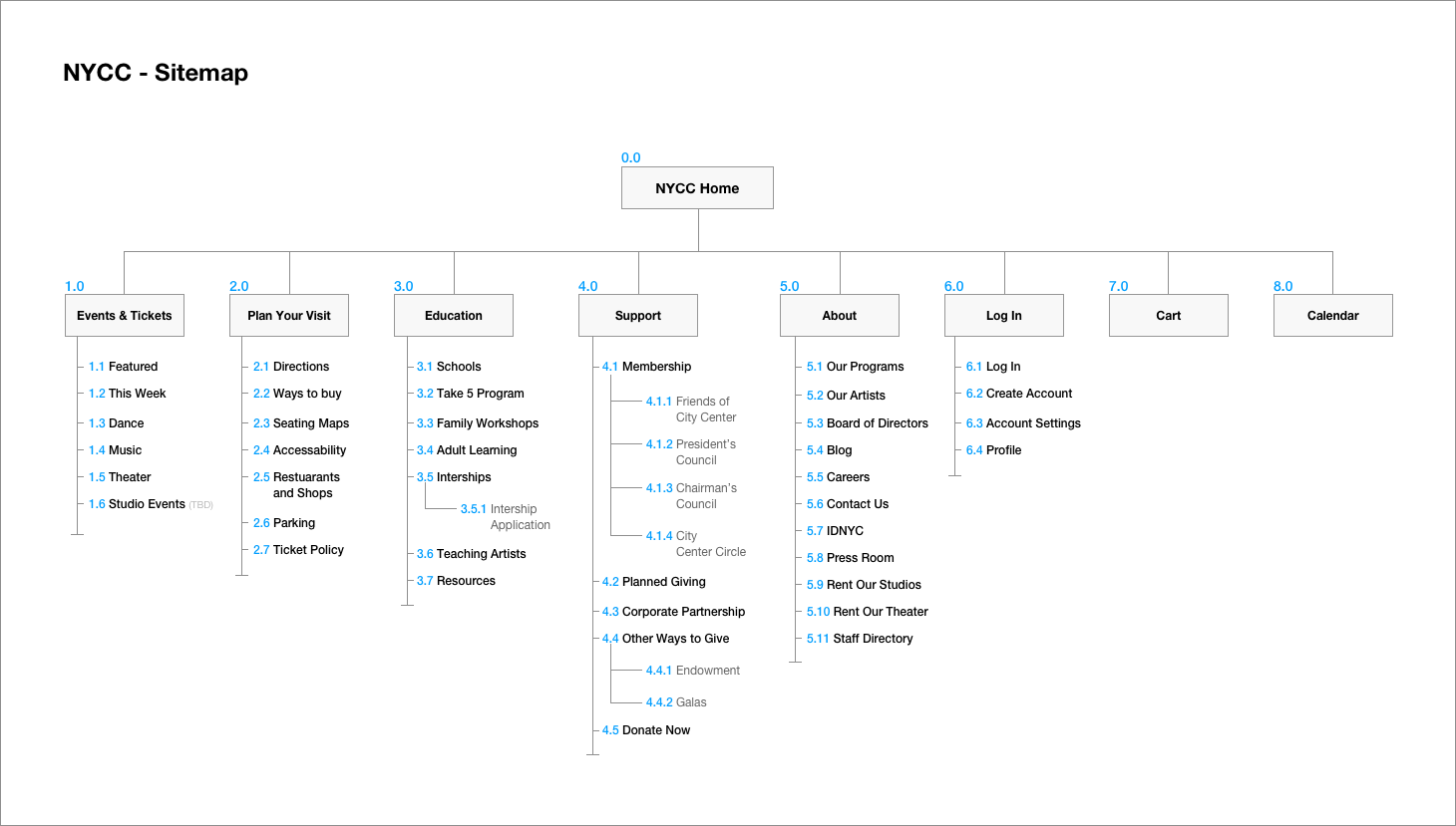
The Sitemap
We did an audit on the information architecture of the old website and and saw that a lot of content was hidden or didn’t have a section on where to live on (ex: sometimes finding a whole page dedicated to one paragraph). We made sure to remove or consolidate information and create new content buckets in order to help make sure it wouldn’t happen again.
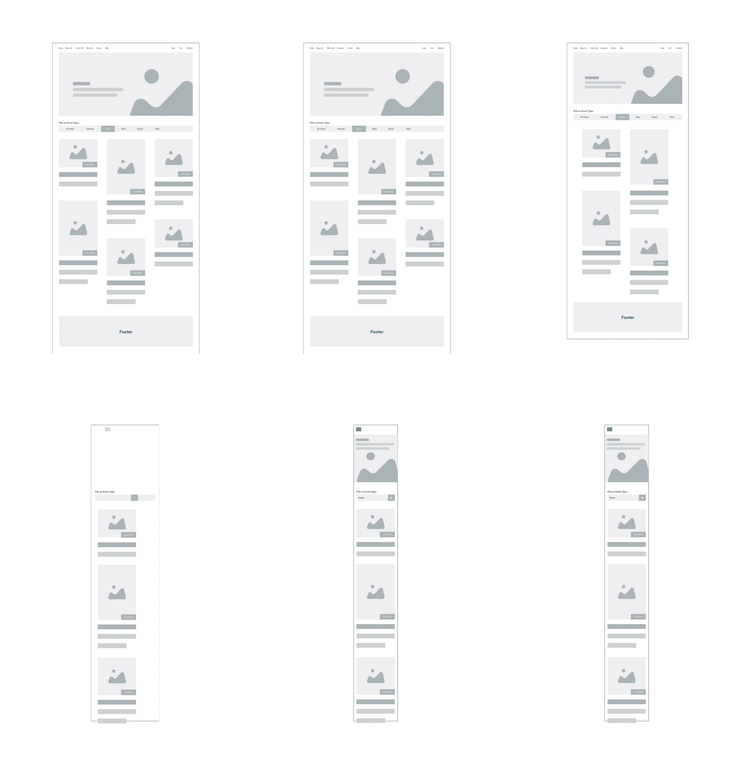
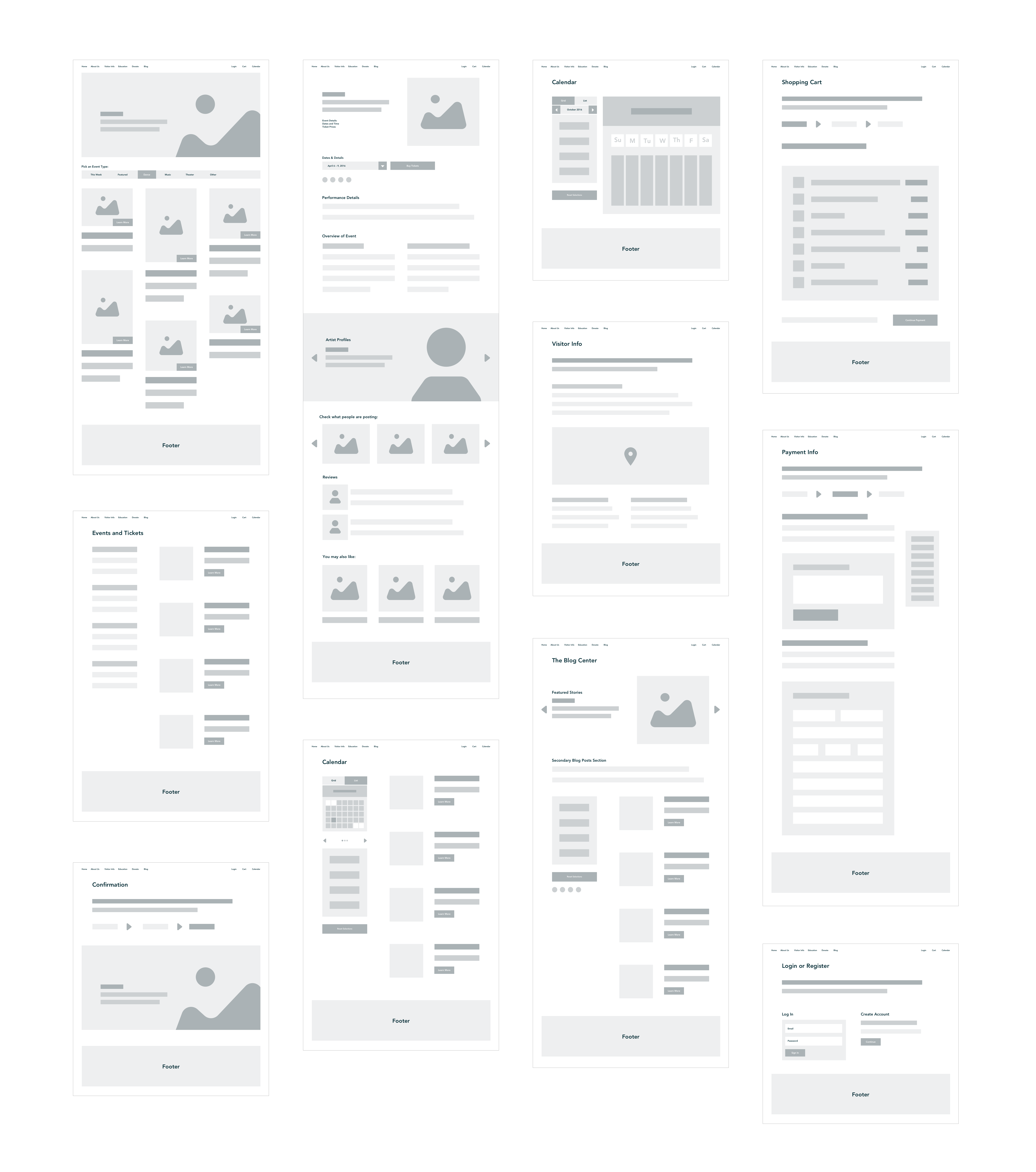
Wireframes
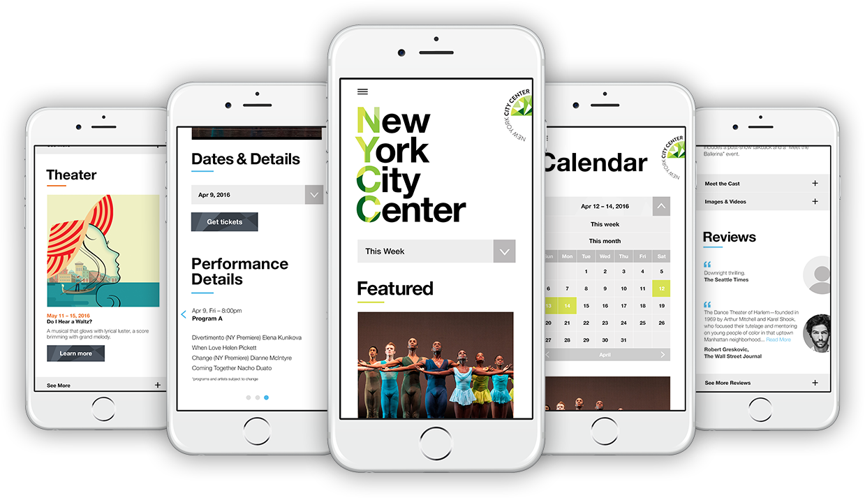
Once we sorted out the information we started to create responsive low fidelity wireframes in order to get a better idea of the layouts.
The Experience
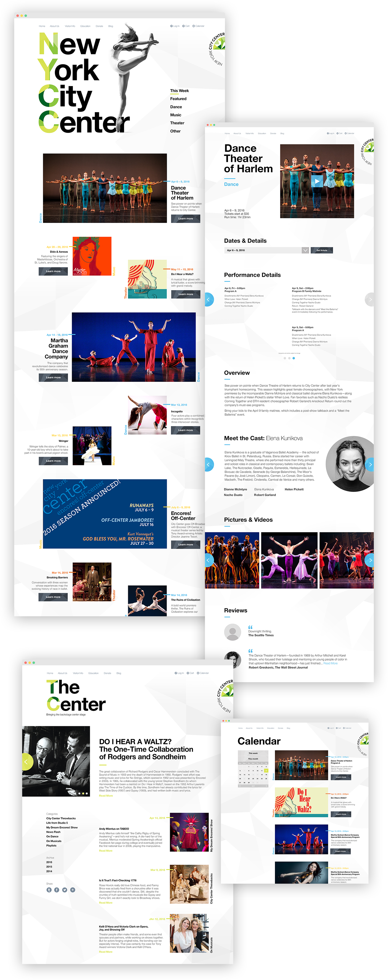
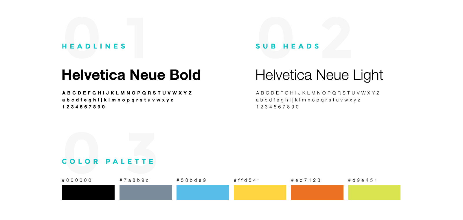
We wanted to create a website that had class and sophistication, with a dash of edge to it in order to help attract and engage audiences from all facets of life. We evolved NYCC’s new branding in order for it to properly live online. We used a bold, clean type face with multiple weights to easily read and differentiate the hierarchy of content. We also used black and white key imagery and assigned NYCC’s brand colors to specific types of content so that users can visually tell the difference between the information chunks and sections that will be exploring. We used a modular grid system in order to keep the information organized and to ensure a proper responsive experience. Below are some examples of functionality the website now has and some of the page designs for both desktop and mobile experiences.
Card and Filter systems
We created filters to let users self-choose the type of shows and events they are most interested in. We also implemented a grided card system that allowed us to house specific information about the shows, events, and other forms of content. Combine all of this with a revamped navigation system and subtle micro interactions, and users now have an engaging and functional website, where they can find and purchase tickets to the shows and events that they are most interested in quickly.
Event details
We picked up that users were interested in certain shows and events but found that they weren’t offered enough information or that it was hidden. We also picked up that users are interested in certain shows based on the cast and what others have shared or said. We decided to remove any barriers and provide users with all the information they might need depending on the dates and times that they choose.
